Run of
Patchwork sampled the FABRIC testbed dataplane on this date and generated the graphs below. See the full run history for other dates, or our paper on Patchwork (PDF) for how the process works.
Beta release. Please send feedback and data or visualization requests to Nik Sultana. You're also welcome to get in touch to contribute code or other improvements. All the code that generated this data and this page is open source.
What was sampled
- Duration of this run
- 12 hours Patchwork ran continuously during this window, across the number of sites indicated below, to sample the dataplane for frames.
- Number of FABRIC sites sampled
- 24 Sites are sampled simultaneously, in parallel. We don't provide site-specific details, and even site names are anonymized on this dashboard.
- Sampling outcome by site
- succeeded 62.50%, failed 8.33%, degraded 29.17%, in progress 0.00% "failed" means that FABlib raised an unrecognized exception during slice submission, or that a site didn't have any smart NICs available at the time. "degraded" means that fewer resources than Patchwork sought were available. "in progress" means the sampling did not complete on time, usually a sign of a site that happens to be very busy.
- Size of data sample (compressed)
- 213M The size of the data sample depends on the level of activity on FABRIC's network during the sampling window, and the coverage of Patchwork's sampling across FABRIC during this window. To generate the graphs below, sampled the data is aggressively reduced to lower the load on our computing resources, since this analysis runs every few days. All sites with more than 1GB of data (uncompressed) are removed from the analysis.
Graphs (First Generation)
- "First Generation" is the set of graphs that this dashboard was configured to produce during its first year of operation. In this generation, further to the discarding of data mentioned above, only 1/100 of the remaining data files are analyzed.
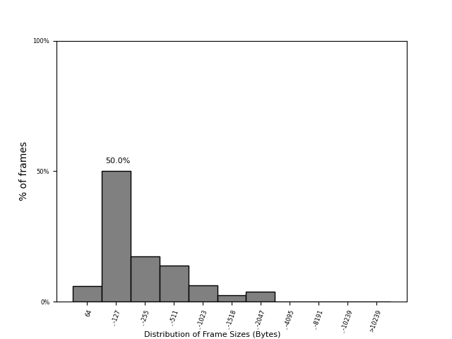
Distribution of frame sizes in FABRIC's dataplane
A histogram of frame sizes. This distribution can hint at the type of workloads that were crossing the network when the sample was collected.
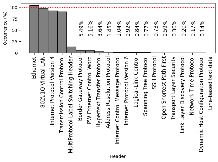
Frequently-occurring protocol headers on FABRIC
A histogram of the most frequently-occurring protocols found in the analyzed sample, complementing the frame-size graph.
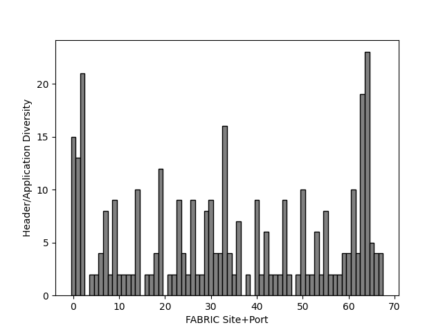
Variety of application and protocol headers across FABRIC site ports
For each anonymised physical network port sampled across FABRIC sites, the variety of different protocols and applications observed while the sample was collected.
Graphs (Second Generation)
- "Second Generation" consists of an additional set of graphs that were produced from the same dataset of each Patchwork run, starting from September 2026.
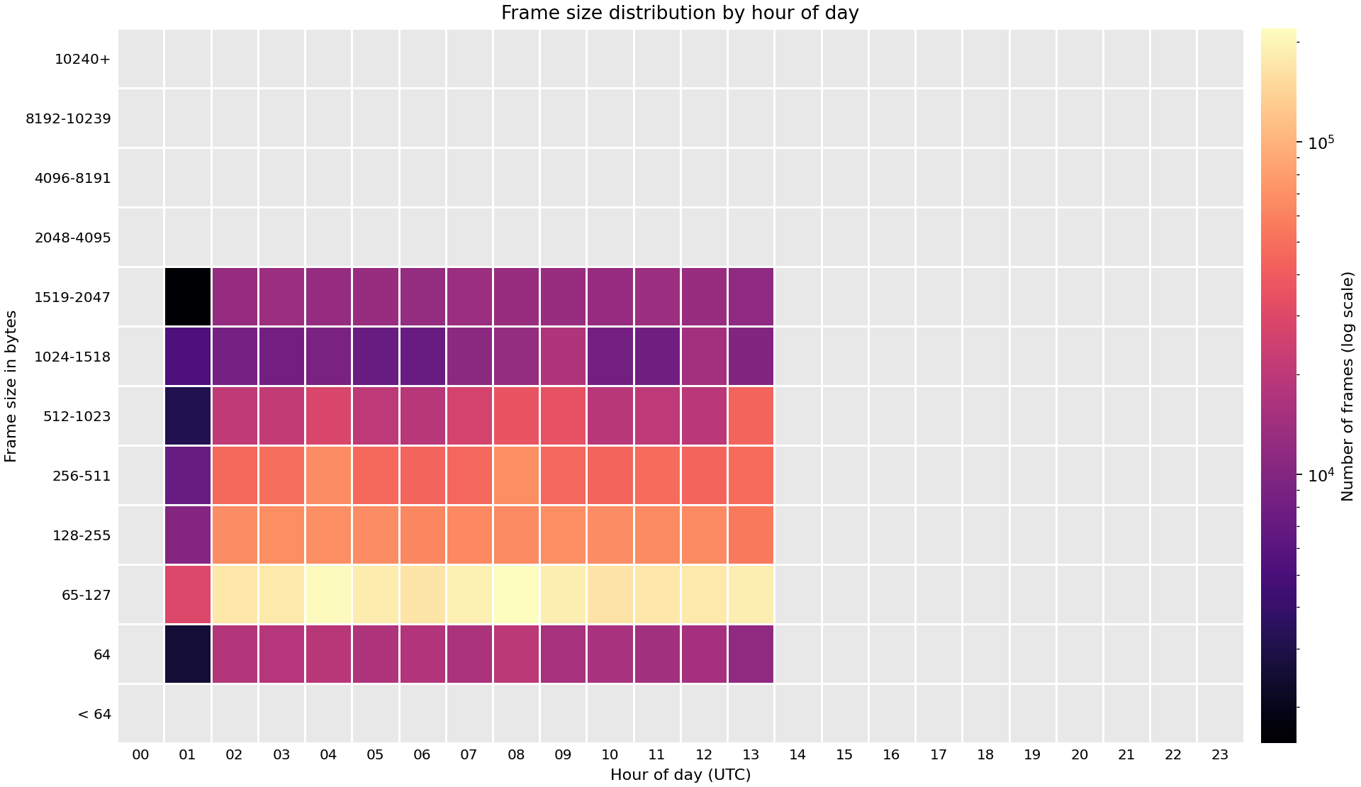
Distribution of frame sizes in FABRIC's dataplane by hour of the day
A heat map showing frame sizes distributed across the 24 hours of a day. This distribution can hint at the type of workloads that were crossing the network when the sample was collected.
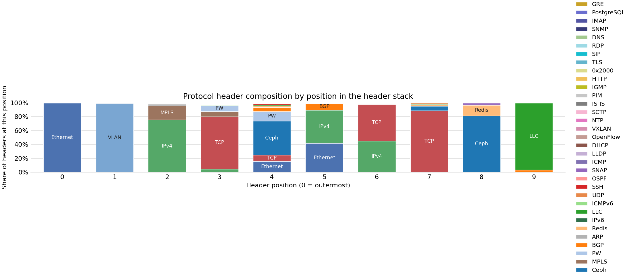
Proportion of protocol headers that occur at different positions in observed header stacks
A bar chart that outlines the encapsulation patterns that were observed when the sample was collected.
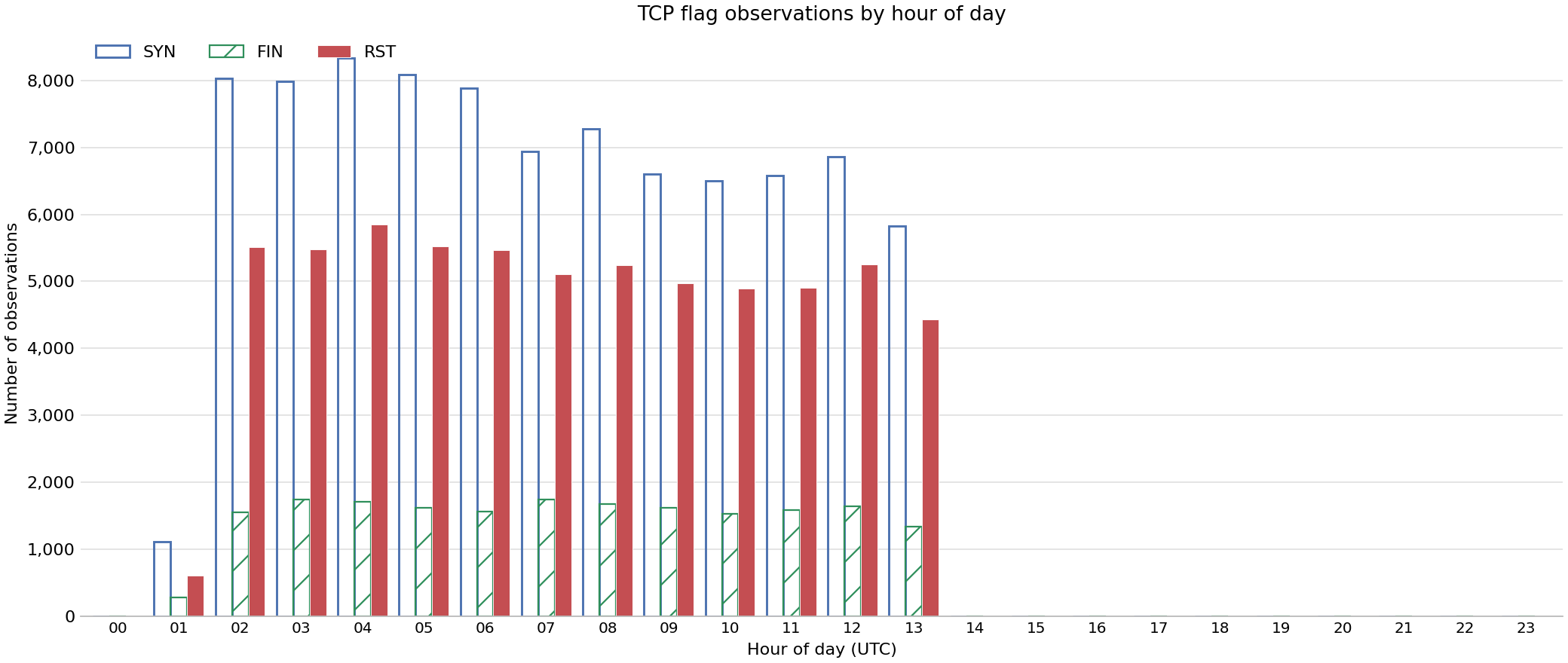
Quantity of TCP SYN/FIN/RST flags observed
The number of observations of specific TCP flags by hour of day.
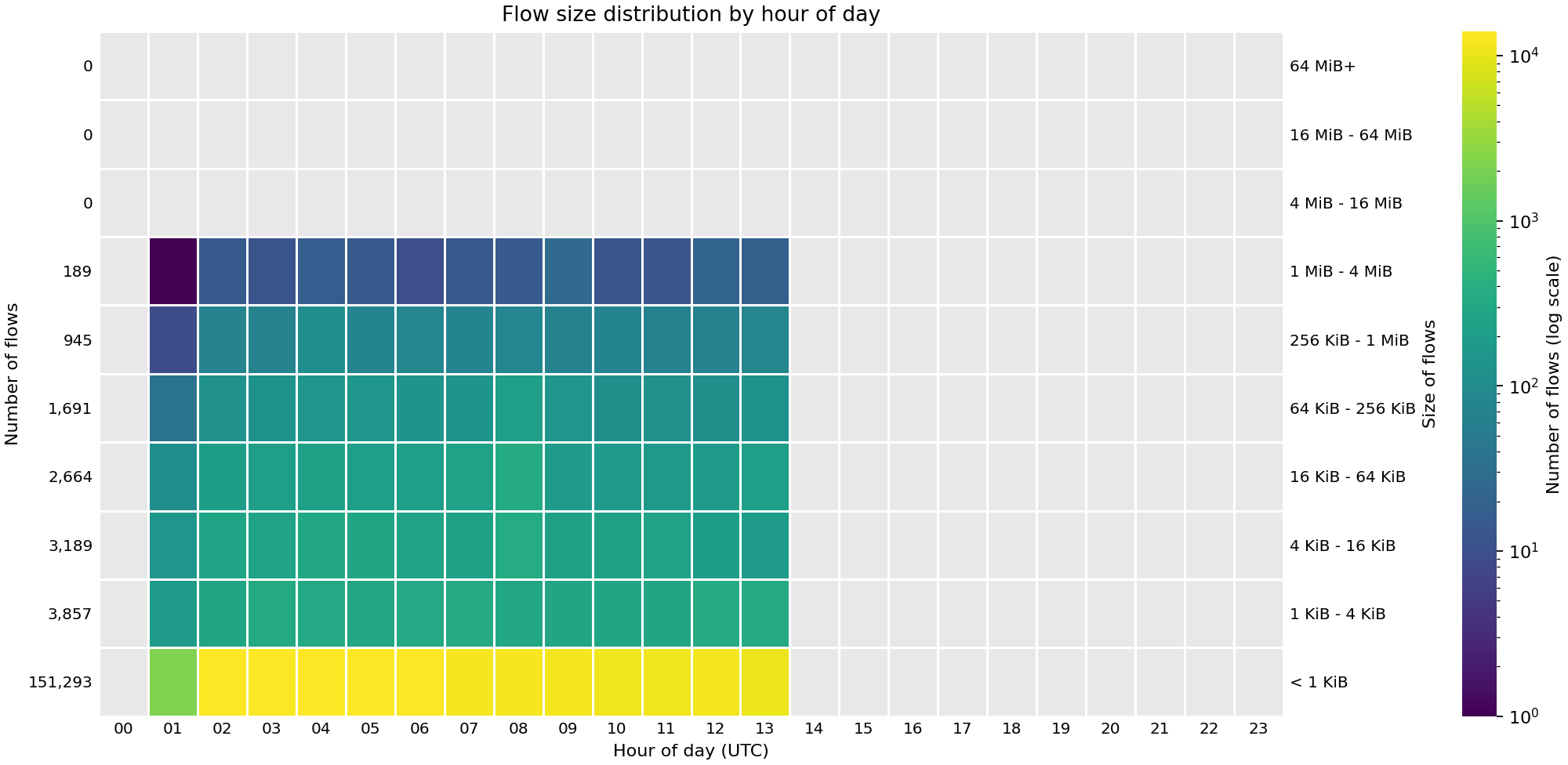
Number of flows
Heat map showing the number of flows across the hours of the day. The y2-axis buckets the data volume bucket transfered by each flow, and the y-axis shows the number of flows in that bucket (across all 24 hours). The "heat" of a cell corresponds to the value that a cell contributes to the total shown in the y-axis.
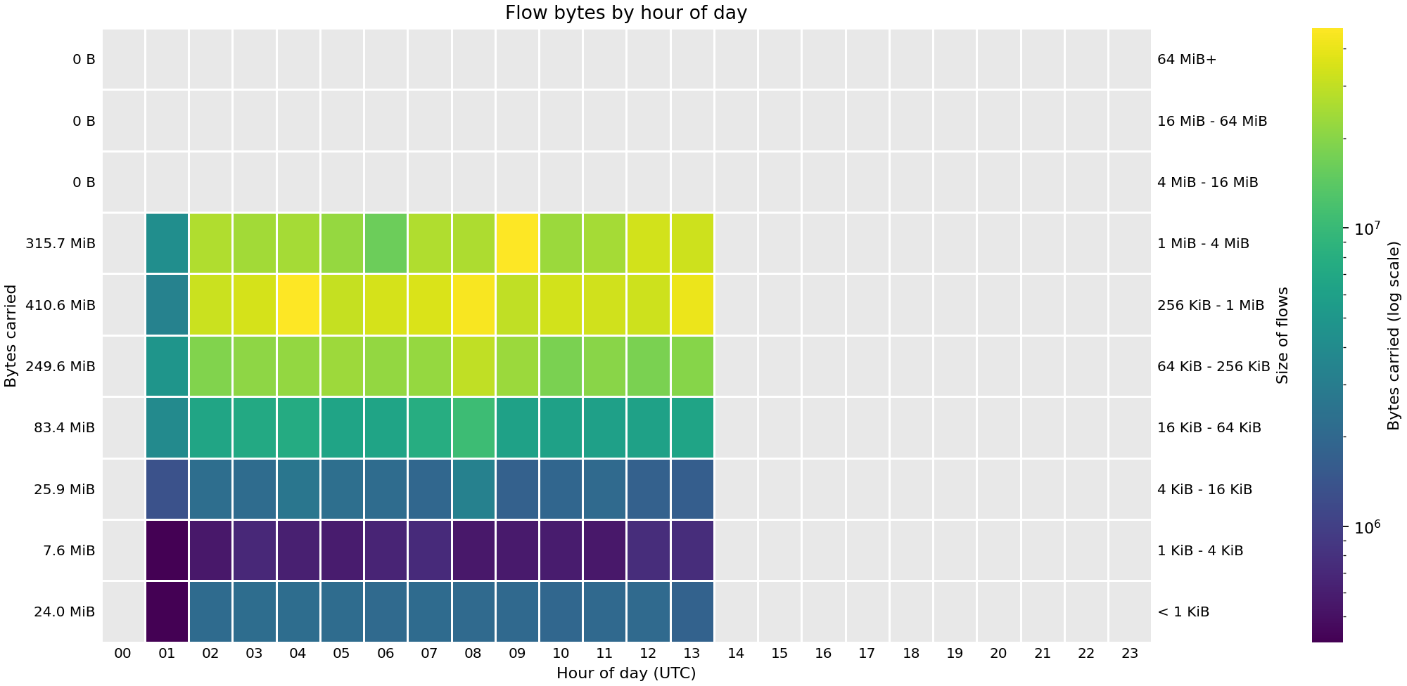
Flow sizes
Similar to the previous graph but the difference is in the y-axis: it measures the total number of bytes transferred by flows of a particular size. And the colour of each cell shows the contribution of the flows during a given hour to the total shown in the y-axis.